The Daily Click ::. News
 

2009 Site Upgrades: New Profile Page & Donation!!
News posted 25th January, 2009 by Rikus  
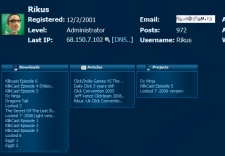
No time to rest! It is time for another site update! For today we have decided to give the profile page a much needed update! Me and flava have been discussing it for a while and thanks to his excellent coding skills we now have a much cleaner profile page. If you are a very active member you must appreciate the new "show all" button, wich keeps your page from being a mile long. Check it out! The new profile page is now online for everyone!

On a side note me and Flava have been planning our next new feature out for the past couple of weeks and Flava has started to code this new/upgraded feature today! I wont say much about it but its been a long time coming since we addressed this one! Also on the flip side clubsoft is working hard on the already announced Resource page, things are heating up here at the site, keep checking in!

Also lets give some big thanks to RedHades for his donation to the site this month! Remember folks we are payed up until march for payments so if you believe in the site and you want us to keep going then please donate as you can see we are always trying to improve the site for you all!


Posted by -MacAdaM- 25th January, 2009

COOOOOOOOOOOOOOOOOOOOOOL!
Haha very nice job Rikus and Flava!
 
Posted by Jon Lambert 25th January, 2009

Awesomeness! So much cleaner now. Thank you Rikus and Flava!

 
Posted by Mikołaj G. 25th January, 2009

Strange - but clearer. There should be small images (thumbs) next to games that this person have done like in Downloads page : - ) .
 
Posted by Jon Lambert 25th January, 2009

Like a mini-downloads page?

 
Posted by Flava 25th January, 2009

Thanks for the donation RedHades
And nice suggestion Mikolaj, I'll think about it
 
Posted by Xhunterko 25th January, 2009

claps to all 3
 
Posted by Marko 25th January, 2009

Yes, thankyouallverymuch!
 
Posted by chrilley 25th January, 2009

ADODB.Recordset error '800a0cc1'

Item cannot be found in the collection corresponding to the requested name or ordinal.

/profile.asp, line 37

Is what I get when accessing a profile.
 
Posted by Mr G 25th January, 2009

It looks too squished actually.

I liked the old one better :/
 
Posted by Richards 25th January, 2009

in my opinion its on my screen only on left - right space is free so it should be centered or something like this. but its just my opinion
 
Posted by Cecilectomy 25th January, 2009

yes i think the profile layout needs to be the same as the account edit page. tables centered and the height of each table should be the size of the biggest one on the row. i dont like them diff sizes it looks goofy and disorganized.
 
Posted by chrilley 25th January, 2009

Now it works!

It does look more messy now to be honest though.
 
Posted by OMC 26th January, 2009

Looks good.
 
Posted by OFFINC/Aharms 26th January, 2009

the site looks great, much needed change!
 
Posted by alastair john jack 26th January, 2009

awesome update!

can finally see Shroomlock's long list of review now.
 
Posted by Flava 26th January, 2009

I've edited the profile page slightly (due to some suggestions). The boxes now fill the whole width of the page, and the titles are no longer shrunk down because of this.

Hope you like the changes
 
Posted by Ski 27th January, 2009

Why do the admins have the rights to have their actions hidden on the active page, yet regular users don't? I don't see what the point of doing this is, you've never had to hide anything in the past, so why start now?
 
Posted by Marko 27th January, 2009

Because they are the Admins and it's up to them what they do?
 
Posted by Ski 28th January, 2009

Admins have powers, granted. But privacy rights should be available to all IMO.


Author Info

Advertisement

Worth A Click