The Daily Click ::. News
 

New Clickteam Website!
News posted 15th June, 2009 by Jon Lambert  
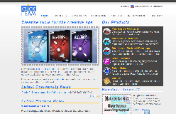
¡Hola, gente! Today is a good day for clicking! Why, you ask? Clickteam has just updated their US site with a brand new layout! It's entirely different and I myself was surprised after having looked at it just two hours before in the original layout. Featuring the new Klikdisc (coming August 2009!) and reformed hubs for each of their products, this new layout improves vastly on the original!

Click here to visit the new site!

With regards to the other sites, their new layouts will be coming as well, with the French version of the site being about 60% complete, and following a different system. The UK version will follow the same system as the US site. Thanks to Jeff for the info!


Posted by Johnny Look 15th June, 2009

Hey you should mention that only the us site changed, the uk and international site still have the same layout.
 
Posted by Jon Lambert 15th June, 2009

Done, thank you for pointing that out!
 
Posted by Fanotherpg 15th June, 2009

I PMed it a to Rob few minutes before the news But nice that you frontpaged it BTW maybe all sites will change to the USA layout?
 
Posted by Jon Lambert 15th June, 2009

According to Jeff, all the sites will be updated.
 
Posted by Silveraura 15th June, 2009

I'm curious though as to why only USA and Canada get a brand new site layout when it's pretty much the exact same site content. I'm from USA too, so it's not even like I'm out of country, and jealous. Anyone have any idea - besides Jeff being from the USA?
 
Posted by Spitznagl 15th June, 2009

Is it just me or they also added a bunch of new tutorials?
Including Streetwise
 
Posted by Ski 15th June, 2009

Streetwise is just among the rest of the 20 event compo entries. The whole purpose of that competition was to gather examples for the new site
 
Posted by [EclektiK] 15th June, 2009

Nice!!!
 
Posted by UrbanMonk 15th June, 2009

Hmm, I tried submitting my games to their creation gallery and they were rejected for no reason. At least none that was given. Anyone know the criteria for game submissions?
 
Posted by Fanotherpg 15th June, 2009

All fields are required ?
 
Posted by UrbanMonk 15th June, 2009

Yes, all fields are required, and were filled out by me. Then I received a denial email that included all the information I submitted.

There was a space for the reason of denial but nothing was there, just a blank space.

Is it because my games aren't good enough?
 
Posted by Kisguri 15th June, 2009

It was because your games were web based (Vitalized) I filled out the reason and it was because of that, and suggested you send them to Madword Arcade, Jason Darby loved them when I suggested it to them, The Creation Gallery will be for downloadable content, and only the best of it, your game would have been accepted if it was not for the web browser based play! Thanks for pointing out the reason was blank, I will have it looked at!
Comment edited by Kisguri on 6/15/2009
 
Posted by Hayo 15th June, 2009

Most games in the creation gallery seem to have the casual commercial click game thing going on. I tried submitting Fishhead 2 back in 2001 but it got rejected as well
 
Posted by Kisguri 15th June, 2009

Hayo to be clear it is the best of Click not the commercial of Click, in fact you have both Turning the tide (Commercial) and Santaman's Muffins (Freeware) in their, Before we launched I did not have alot of non commercial games to post, So please if you have a excellent freeware title, submit it. Also submit to KlikDisc to if you want!
 
Posted by Fanotherpg 15th June, 2009

Maybe it was a system mistake PM Jeff at CT Forums
 
Posted by UrbanMonk 15th June, 2009

Alright, thanks for the quick reply!

The only problem I have with the madworld arcade is the lack of a built in online highscore system.

I much prefered the v-cade but it seems to have died. It's a shame too because there are a lot of good games there.
 
Posted by Rikus 16th June, 2009

Phew Finally! I have known about this for a while so its good to finally see it live. Btw the site was made by our very own Dan (Pulsecode) And his team so hands up for them, good work!
 
Posted by Ski 16th June, 2009

Who is Pulsecode?
 
Posted by Kisguri 16th June, 2009

Dan has been a clicker for almost a decade, I worked with him on Solar Rescue Denetsu to name one of his titles, Great Clicker and great guy!
 
Posted by Assault Andy 16th June, 2009

Looks pretty cool!
 
Posted by Don Luciano 16th June, 2009

Have u seen 20 events rts tutorial, quite nice, quite confusing aswell too bad it gets quite laggy after 5 lvl.
 
Posted by Assault Andy 16th June, 2009

I just looked at the RTS. That's pretty nuts
 
Posted by Dr. James MD 16th June, 2009

Yup, that's a website alright.
 
Posted by pulsecode. 18th June, 2009

Yes, a website it is indeed
Glad it's finally launched. Now for the tuning!
 
Posted by MBK 18th June, 2009

I liked the old layout better.
This one seems to push the product to the foreground a bit more though, which is probably a good thing, I don't know.
The other style just seemed less intrusive and not as visually abusive to the eyes. (maybe it's just too colourful?) I really don't know what it is, but for some reason, just like the old version better, weird huh?

Maybe the tuning will fix the visual impediment that I can't quite place my finger on as to what it is.

Comment edited by MBK on 6/18/2009
 
Posted by Cecilectomy 18th June, 2009

there really needs to be a cookie for that country select page. so i dont have to see it every time. i COULD just bookmark the longer url but thats just too much work
Comment edited by rand(0, $Cecil); on 6/18/2009
 
Posted by pulsecode. 18th June, 2009

Haha yeah, the region select page cookie code is broken. Nothing to do with me!!
I think we'll be fixing it shortly though.


Author Info

Advertisement

Worth A Click