The Daily Click ::. Projects ::. Motherworld
 

Project: Motherworld
Project Started: 29th June, 2008 Last Update: 31st October, 2011
Project Owner: Otter Project Members: CraigT
Project Type: RealTime Simulation and RPG Project Progress:
More Info: n/a Faves: 6

Almost starting over... Oh yeah, and no ripped sprites
Posted 30th Oct 08, by Otter  
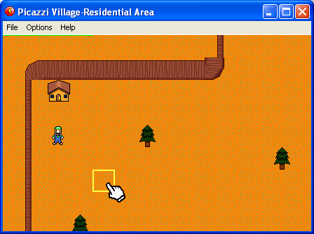
I took about a 2 month break from the game, entered a halloween compo, made a game called Slaughter, and did a couple of other stuff. When finally looking back at the file, I didn't know what to do. Some part of me kept screaming at me just do it over, go ahead and waste some more summers. But part of me didn't want to. So I'm almost starting over, it's not as nooby now, no push buttons, has scrolling text. Plus I decided to get rid of the ripped sprites, so at least it can be a somewhat respected fan game. Go ahead, click on the pic. That's a some custom graphics I've been working on, they look great and I plan to use them. So yeah, I'm gonna waste some more summers on this. (Well hopefully only one more, but you never know.) Preview

Preview


Posted by Jon C-B 30th October, 2008

Looks pretty good, except the houses are really small...
 
Posted by Otter 30th October, 2008

Yeah, I'm gonna take care of that I was to lazy to resize at the moment. The actual game will be zoomed in more, this is just zoomed out so you can see it better.
 
Posted by -Dark Martin- 31st October, 2008

:|...

Erm...

*cough*
 
Posted by Otter 31st October, 2008

Yes Martin?
 
Posted by alastair john jack 31st October, 2008

Looking pretty good, but for the final can it have a smaller window size?
BTW! JPG quality is yuck PNG?
 
Posted by Otter 31st October, 2008

Uh, I saved it in png, but photobucket converted it for some reason. Huh, what's a good way to shrink the window size without window control, because it resizes the game for some reason...
 
Posted by Jon Lambert 31st October, 2008

Just change the default window size in the game's properties...
 
Posted by AndyUK 31st October, 2008

The graphics are a bit sparse and the floor looks horribly tiled. I don't really like the look.

The luigi sprite is ok though.
 
Posted by Otter 31st October, 2008

Look at the grass in the second pic, it's a bit more realistic.
 
Posted by Jon C-B 4th November, 2008

2nd pic is much better
 
Posted by Otter 4th November, 2008

Thanks Jon! Plus notice the hand and the square? It'll use mouse controls for movement, kinda like point and click.


Project Forums


Favourite

Advertisement

Worth A Click