Project: The Miners
Update
|
Posted 16th Mar 15, by Nornik
|
|
First of all, my apologies that I did not put any update here about the project for a long time. I can understand that you could get the impression that project is abandoned. I would like to assure you that it is not. Since last time I made some changes in the game. Let me write few words about them.
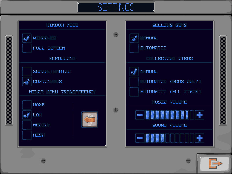
The most important change is in fonts. I replaced all system fonts, all system text objects and system list objects with my own. Thanks to that, game looks much, much better. This change, allowed me to implement another update. Fullscreen. Yup, original window size of the game is 800x600 pixels. But, if someone don't like to play in window, now he or she can switch on fullscreen mode. I'm really happy that I managed to do this.
Another very important change is tutorial. At the beginning I did not plan to create it. I thought that the game is so easy to learn, that some instructions presented in static screens with small description will be sufficient. Well, I was wrong. During Indie Showcase 2014 I realized that game, and game controls are not so easy, especially for a players who never played Diggers on Amiga. For all these players, I have prepared really nice tutorial, which will learn you, step by step, how you can move your miners, how dig tunnels, sell gems, use items or use additional icons placed on the HUD. After all, learning and playing at the same time is the best option.
I did not forget about interface. There are two major changes here. First one is resignation from possibility of deselect miner. This, from gameplay point of view, was completely... useless. Moreover, it created more confusion when player deselected miner accidentally and later tried to move him - of course vainly (I learned this on mentioned Indie Showcase). From technical point of view, this was necessary to access minimap, backpack or game menu - what obviously was not convenient. So, the second change is that, all menus are accessible with selected miner.
All clickable icons are changing while mouse cursor is above them. This helps in navigation, and simply tells player which icons are active and which are not. Many icons in game menus were redrawn, to be in the same style.
There are also some changes in bank and shop. I have added small counters, close to the icons of gems that currently bank is buying, which shows amount of that kind of gems that miner has in his backpack. No need to remember what he has while entered the bank. This is small change but with great effect. Shop graphics were slightly updated. Also, current cash counter was added to the shop (near item price), so player don't have to run with his eyes on whole screen, to check if he has enough cash to buy particular item.
As I'm talking about graphics update, it is worth to mention about small changes in grassland terrain. I decided to darken mined tiles. There is much more contrast between mined and not-mined dirt, and this simply... looks better (at least in my opinion).
Achievements. Well, they remained as they were, but on achievements screen, I replaced "question marks" of undiscovered rewards with "greyed" icons. This not only looks much better (heh, again much), but also may slightly help in getting achievements (what not always is so easy). Names of newly get achievements are showed in yellow. All others in regular blue color.
I have also adjusted scrolling which now is much more smooth.
Some other minor changes were implemented (like different color of active miner on minimap screen), as well some small bugs were discovered and removed.
Please see few presented screenshots were you can see some implemented changes.
|


|
|
|
Is this worth a look? Let others know!  Favourite Favourite
|
 Project Forums
 Favourite
 Advertisement